BnBerryShipped project
BnBerry: the monthly host email — from a review digest to revenue and actions
The final email is 2.2× shorter than the minimal version: revenue by channel, AI agent results and the top 3 fixes ranked by impact
- Problem
- The first version was a review digest where everything was equally loud: hosts had to work out what mattered, and the product's value didn't show
- My role
- Designed three versions of the email and the email components in Figma
- Timeline & team
- 2026
- Outcome
- How we measure: open rate, clicks on “Go to portal”, early-access sign-ups for Review Intelligence
Monthly emails for hosts and property managers · Email, 600–700 px · Figma (components, variables)
01 · Problem
The email had a minute to show value, but Version 1 made everything equally loud
Product
BnBerry helps short-term rental hosts and property managers on Airbnb and Vrbo: an AI agent replies to guests, and Review Intelligence analyzes reviews and suggests what to fix at each property. The monthly email is the main touchpoint with hosts outside the product.
The email's job
In one minute, the email has to show hosts the product's value and bring them back to the portal.
What was wrong
The first version was a review digest. Every issue already had a next step, but everything was equally loud: hosts had to work out what mattered, and the product's value didn't show.
02 · Three versions
Three versions: from a review digest to a results email
Version 1 · Voice of Guest
Every issue has a next step, but nothing is prioritized
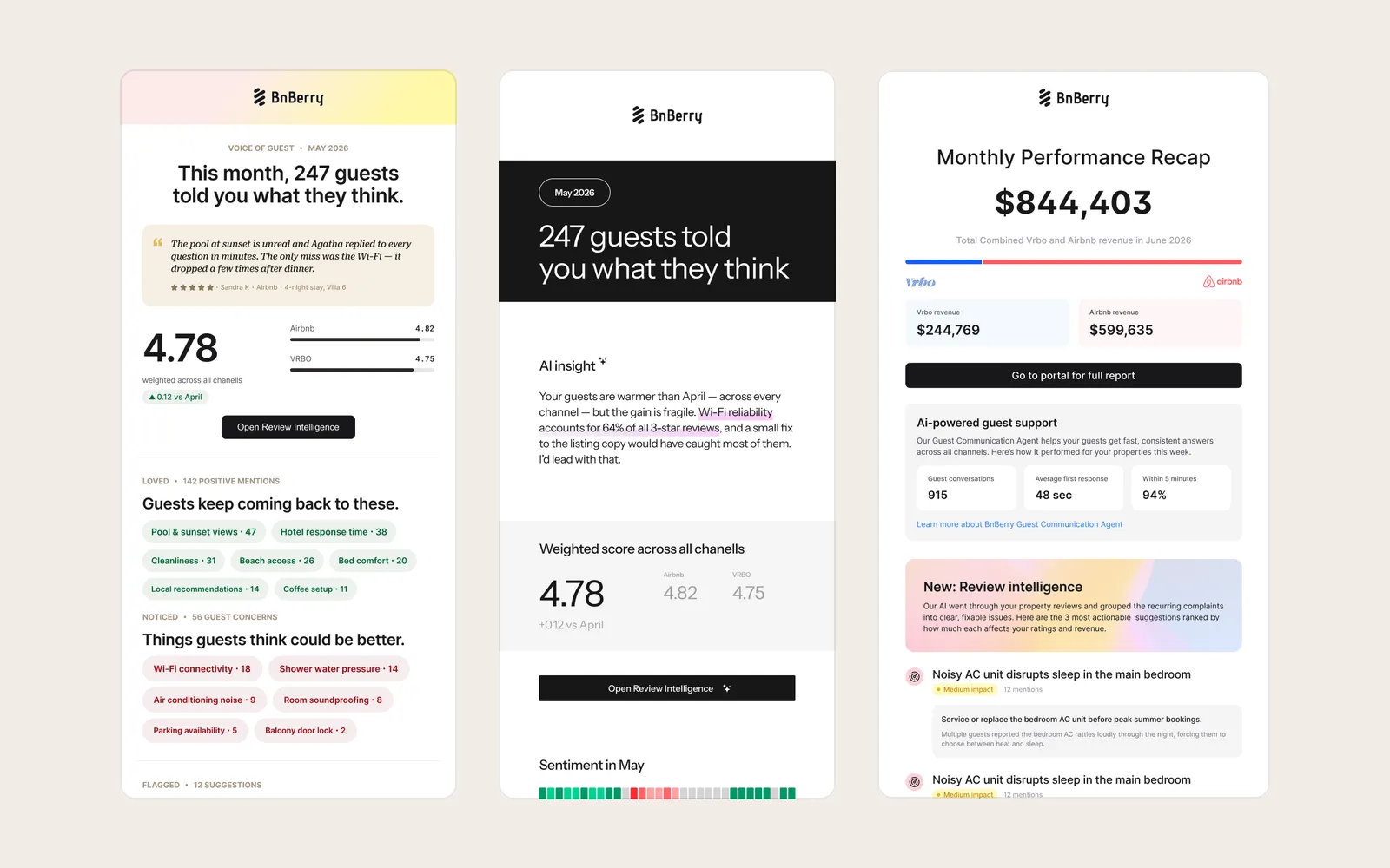
A digest — “This month, 247 guests told you what they think”: a guest quote, rating by channel, and Loved, Noticed, Flagged and Listing transparency blocks. Every issue gets a “Suggested fix” and an Apply button, but everything is equally loud.
Version 2 · Minimal (semi-approved)
The key insight up top, but the email got longer
Monochrome instead of colored chips, and an AI insight at the top: Wi-Fi drives 64% of all three-star reviews, so start there. Below it came daily sentiment, a “why this will work” line on suggestions and new tiles — making it the longest of the three: 4,192 px vs. 2,690 for Version 1.
Version 3 · Monthly Performance Recap (approved)
Revenue first, then the why
The email opens with the number hosts care about most — revenue split by Vrbo and Airbnb — then the AI agent's results: conversations, share answered within 5 minutes, first response time. Review analysis becomes a Review intelligence announcement: three suggestions ranked by impact on rating and revenue, and a single button — “Sign up for early access”.
Result
The final email is 1,867 px — 2.2× shorter than the minimal version.
All screens (7)
More on the versions
- Version 1: Loved — 142 positive mentions as chips, Noticed — 56 remarks as chips, Flagged — issues with a quote, a “Suggested fix” and Apply, Listing transparency — tips for listing copy.
- Version 2: in Flagged concerns the quote, sentiment and suggestion come with a “why this will work” line; Why guests return and Guests hesitant to complain are tiles showing what guests praise and what they complain about less often.
- Version 3: Review intelligence suggestions are tagged “Medium / Low impact”.
03 · Components
The email is built from components, like a product
Components and variables
Header, footer, button, action card, impact tag, issue row and stars are Figma components; colors and spacing (16 / 20 / 24) are variables. A new email is assembled from ready-made blocks, not drawn from scratch.
04 · Results
How we measure
We check the solution against three metrics:
| Metric | Why | Expected |
|---|---|---|
| Open rate | Compared with the review digest | ↑ up |
| Clicks on “Go to portal for full report” | Does the email bring hosts back into the product | ↑ up |
| Early-access sign-ups | For Review Intelligence — via the “Sign up for early access” button in the email | ↑ up |